
Ieh corp rebrand
About ieh corp
IEH Corporation designs, develops and manufactures printed circuit board connectors and custom interconnects for high performance applications. The Company designs and manufactures hyperboloid connectors that accommodate military and aerospace specification standards. It markets primarily to companies in defense, aerospace, space and industrial applications, in the United States, Canada, Europe, Southeast and Central Asia and the Mideast. It serves customers in the United States and internationally. It manufactures PCB connector offerings for specialized applications and its customers include defense contractors, commercial aerospace equipment manufacturers, medical device manufacturers, oil and gas exploration firms, and commercial space launch companies. It sells both directly and through distributors.
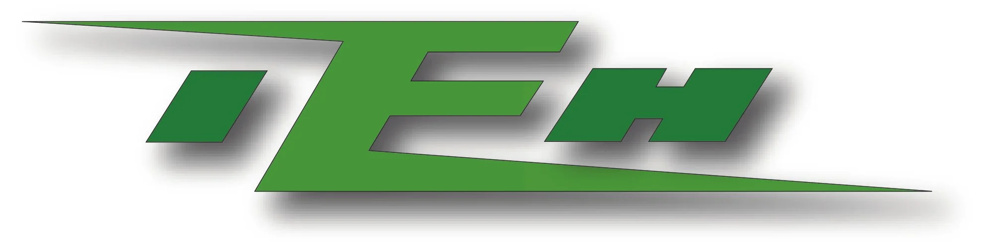
Old ieh logo
The old IEH logo, while loved by company leadership— featured a few problematic design elements. The elements that I immediately wanted to address were the scale, hierarchy, and spacing of the letters, the “arms” on the letter E, the two different greens, and the drop shadow.
The old logo had been used for many years and the company leadership was fond of it so part of my task was to not veer too drastically away from what they were familiar with.

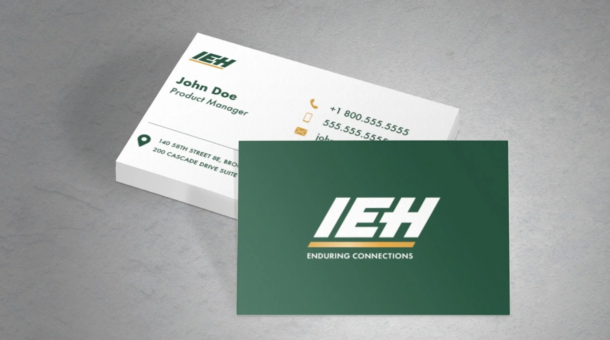
I led the modernization of IEH Corporation’s brand identity—updating an 80-year legacy system to better reflect the company’s role in precision connector manufacturing for defense, commercial aerospace, medical device, and space innovation sectors.
The refreshed logo features a forward slant, symbolizing momentum and IEH’s commitment to future-focused engineering. I developed a strategic color palette where the new dark green represents growth while reinforcing the company’s trusted, authentic history. A golden underscore draws directly from IEH’s use of high-quality materials—including the gold used in their connectors—serving as a visual cue for precision, craftsmanship, and performance.
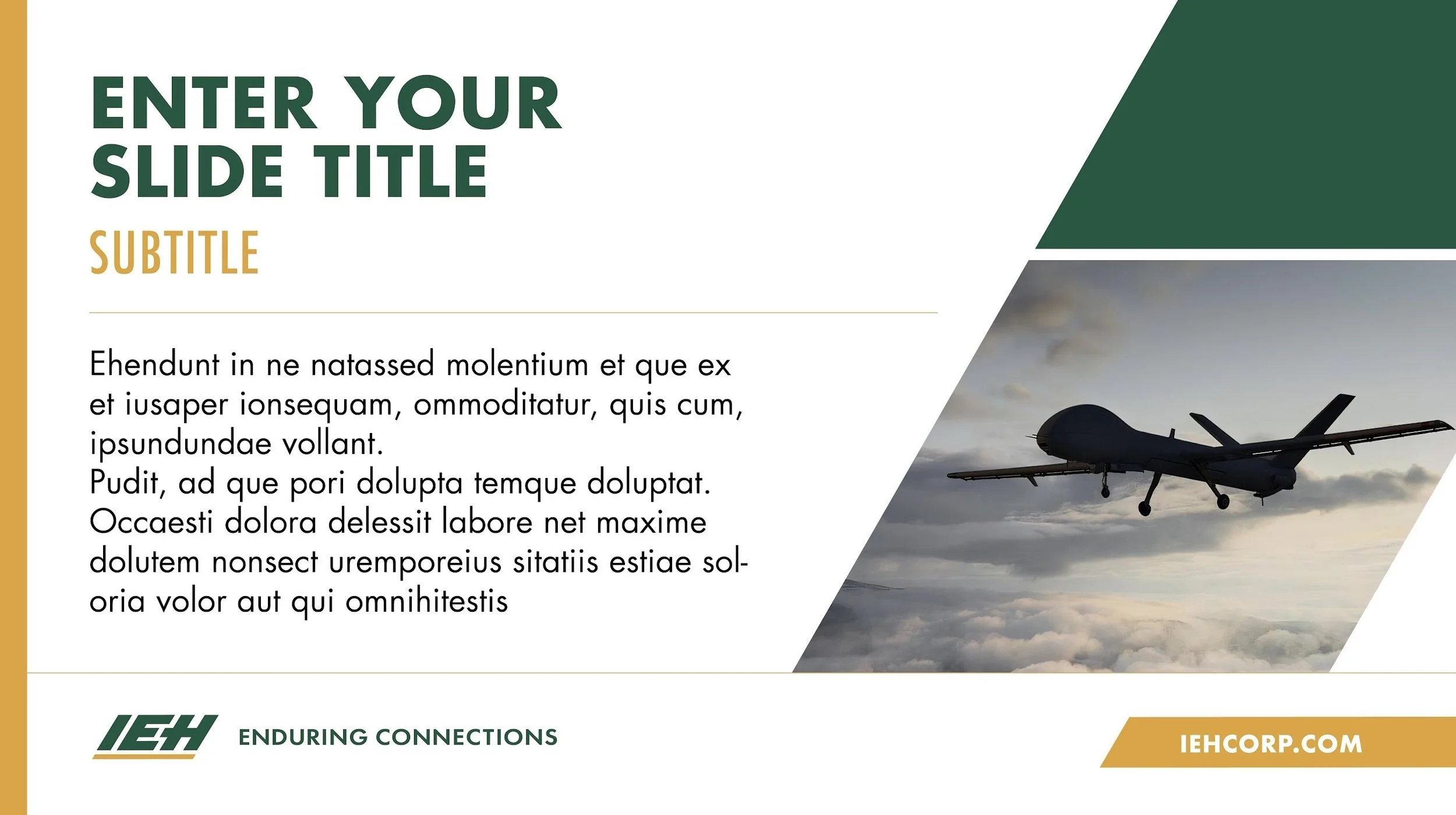
I delivered a cohesive brand system across print, digital, and promotional applications, successfully rolling out the updated identity company-wide across all touchpoints.
New logo
The IEH logo and underscore are made of verticals at a 60º angle, when creating additional design elements the diagonal tilt should always be forward at 60º. This forward slant embodies the company’s lean into innovation and the future.
IEH’s new dark green symbolizes growth while also representing the company’s trusted & authentic history.
The golden underscore connects to IEH’s use of quality materials, such as the actual gold used for their connectors. The gold underscore symbolizes IEH’s precision and quality.
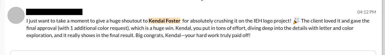
Feedback on client reception.